
Overview
Data cleaning? Oh yeah, I live for this stuff. This project was all about whipping a messy dataset into shape and transforming raw shark attack data from 2013 to 2023 into clear, actionable insights. Because let’s be real, if you want solid takeaways, you need clean, structured data.
Overview
Data cleaning? Oh yeah, I live for this stuff. This project was all about whipping a messy dataset into shape and transforming raw shark attack data from 2013 to 2023 into clear, actionable insights. Because let’s be real, if you want solid takeaways, you need clean, structured data.
Overview
Data cleaning? Oh yeah, I live for this stuff. This project was all about whipping a messy dataset into shape and transforming raw shark attack data from 2013 to 2023 into clear, actionable insights. Because let’s be real, if you want solid takeaways, you need clean, structured data.
Overview
Data cleaning? Oh yeah, I live for this stuff. This project was all about whipping a messy dataset into shape and transforming raw shark attack data from 2013 to 2023 into clear, actionable insights. Because let’s be real, if you want solid takeaways, you need clean, structured data.
So, what did I do? I tackled inconsistencies, standardized formats, and removed junk data so we could build a dashboard that actually tells a story.
So, what did I do? I tackled inconsistencies, standardized formats, and removed junk data so we could build a dashboard that actually tells a story.
So, what did I do? I tackled inconsistencies, standardized formats, and removed junk data so we could build a dashboard that actually tells a story.
So, what did I do? I tackled inconsistencies, standardized formats, and removed junk data so we could build a dashboard that actually tells a story.
Data Cleaning: Making Order Out of Chaos
Data Cleaning: Making Order Out of Chaos
Data Cleaning: Making Order Out of Chaos
Step one? Roll up the sleeves and get our hands dirty. Here’s how I took this dataset from hot mess to data goldmine:
Step one? Roll up the sleeves and get our hands dirty. Here’s how I took this dataset from hot mess to data goldmine:
Step one? Roll up the sleeves and get our hands dirty. Here’s how I took this dataset from hot mess to data goldmine:
Step one? Roll up the sleeves and get our hands dirty. Here’s how I took this dataset from hot mess to data goldmine:
1. Preserving the Original Data
First things first, always keep a backup. I duplicated the dataset to make sure I could track every change. No accidental data losses on our watch.
1. Preserving the Original Data
First things first, always keep a backup. I duplicated the dataset to make sure I could track every change. No accidental data losses on our watch.
1. Preserving the Original Data
First things first, always keep a backup. I duplicated the dataset to make sure I could track every change. No accidental data losses on our watch.
1. Preserving the Original Data
First things first, always keep a backup. I duplicated the dataset to make sure I could track every change. No accidental data losses on our watch.
2. Filtering for Relevance
2. Filtering for Relevance
2. Filtering for Relevance
2. Filtering for Relevance
Removed duplicate records (because who needs redundant data?)
Removed duplicate records (because who needs redundant data?)
Removed duplicate records (because who needs redundant data?)
Removed duplicate records (because who needs redundant data?)
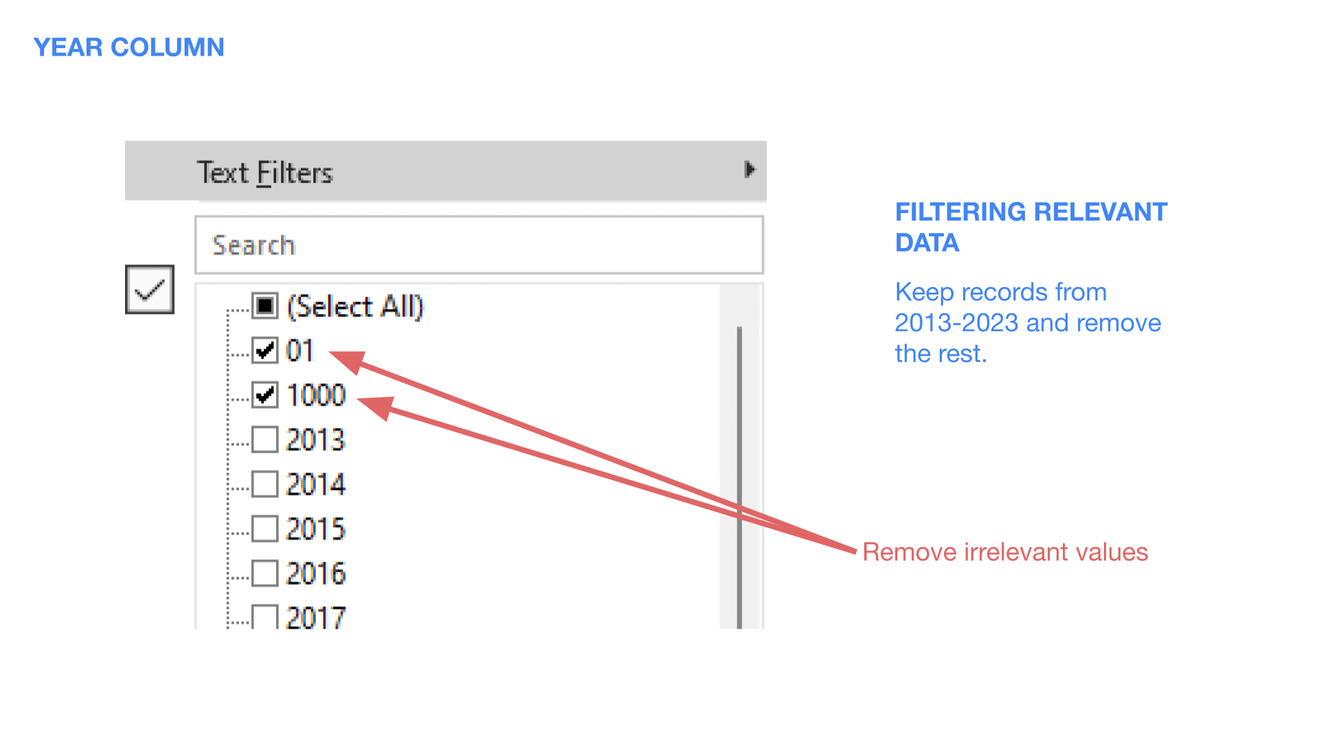
Focused only on shark attacks from 2013 to 2023, anything outside that window got the boot.
Focused only on shark attacks from 2013 to 2023, anything outside that window got the boot.
Focused only on shark attacks from 2013 to 2023, anything outside that window got the boot.
Focused only on shark attacks from 2013 to 2023, anything outside that window got the boot.
Spotted and eliminated non-year values in the Year column (because “01” is not a year).
Spotted and eliminated non-year values in the Year column (because “01” is not a year).
Spotted and eliminated non-year values in the Year column (because “01” is not a year).
Spotted and eliminated non-year values in the Year column (because “01” is not a year).
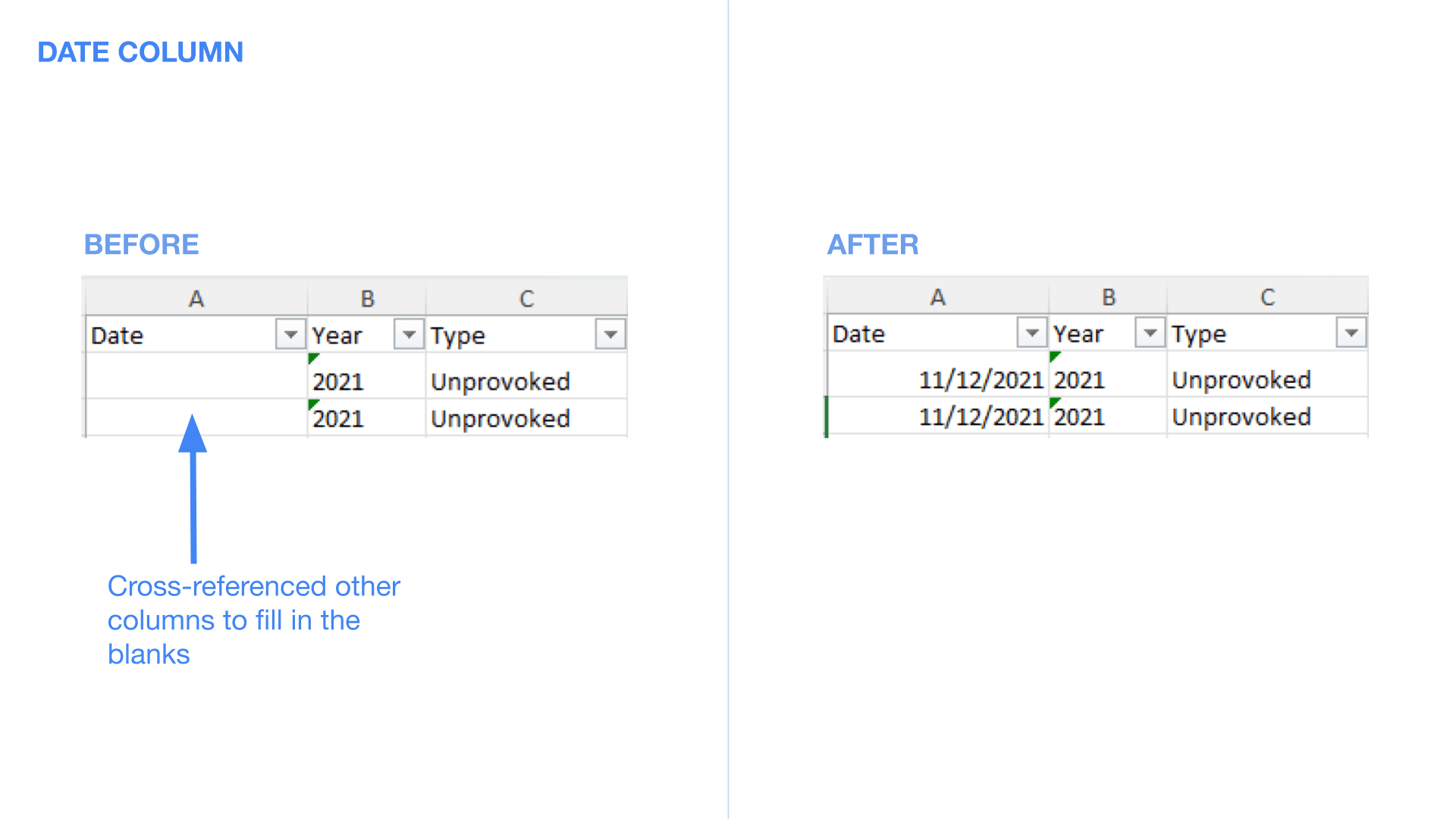
3. Cleaning Up the Date Column
Cross-referenced other fields (like Investigator Source and PDFs) to correct inconsistent or missing dates.
3. Cleaning Up the Date Column
Cross-referenced other fields (like Investigator Source and PDFs) to correct inconsistent or missing dates.
3. Cleaning Up the Date Column
Cross-referenced other fields (like Investigator Source and PDFs) to correct inconsistent or missing dates.
3. Cleaning Up the Date Column
Cross-referenced other fields (like Investigator Source and PDFs) to correct inconsistent or missing dates.
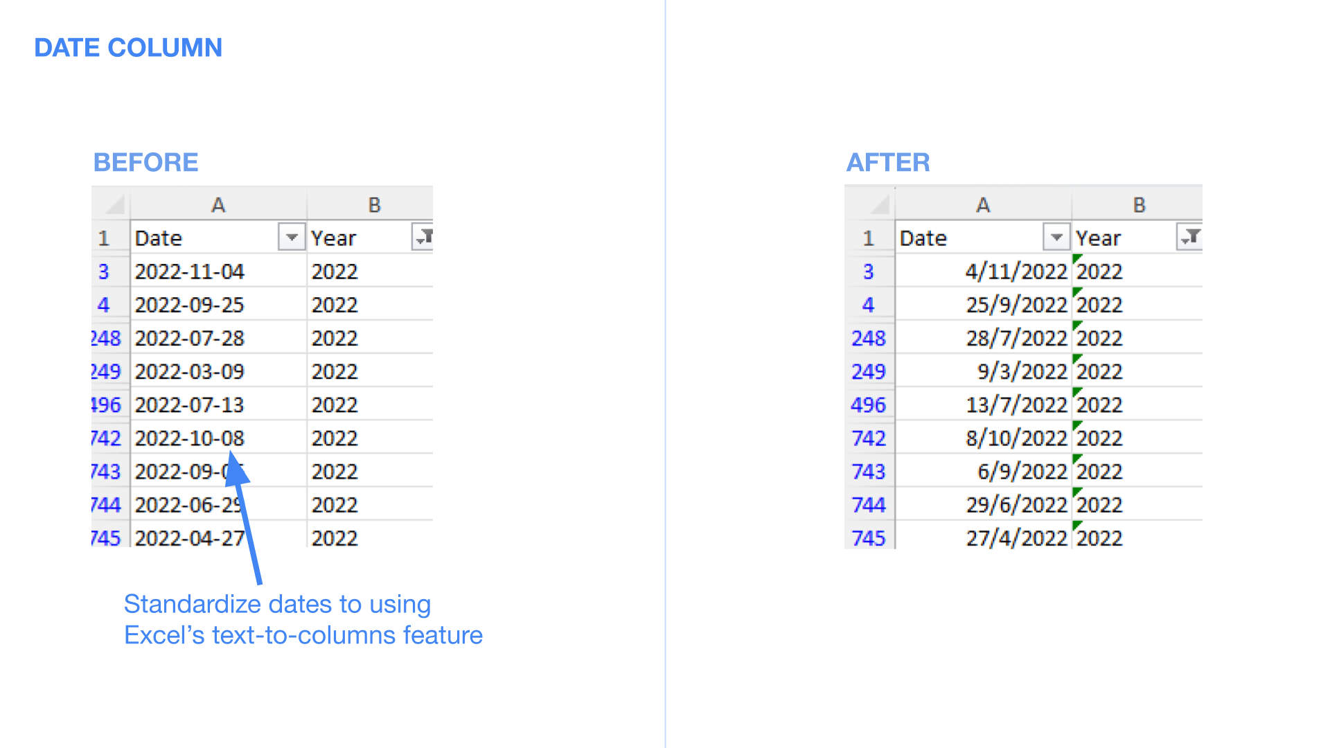
Standardized everything into dd/mm/yyyy format because I like things neat.
Standardized everything into dd/mm/yyyy format because I like things neat.
Standardized everything into dd/mm/yyyy format because I like things neat.
Standardized everything into dd/mm/yyyy format because I like things neat.
Extracted months for better trend analysis using Excel’s TEXT function.
Extracted months for better trend analysis using Excel’s TEXT function.
Extracted months for better trend analysis using Excel’s TEXT function.
Extracted months for better trend analysis using Excel’s TEXT function.

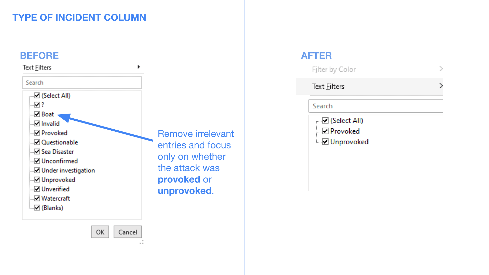
4. Filtering Out Irrelevant Incidents
The “Type” column was a mess, filled with entries like “Unverified” and “Questionable.” I filtered out anything that wasn’t a confirmed shark attack.
4. Filtering Out Irrelevant Incidents
The “Type” column was a mess, filled with entries like “Unverified” and “Questionable.” I filtered out anything that wasn’t a confirmed shark attack.
4. Filtering Out Irrelevant Incidents
The “Type” column was a mess, filled with entries like “Unverified” and “Questionable.” I filtered out anything that wasn’t a confirmed shark attack.
4. Filtering Out Irrelevant Incidents
The “Type” column was a mess, filled with entries like “Unverified” and “Questionable.” I filtered out anything that wasn’t a confirmed shark attack.
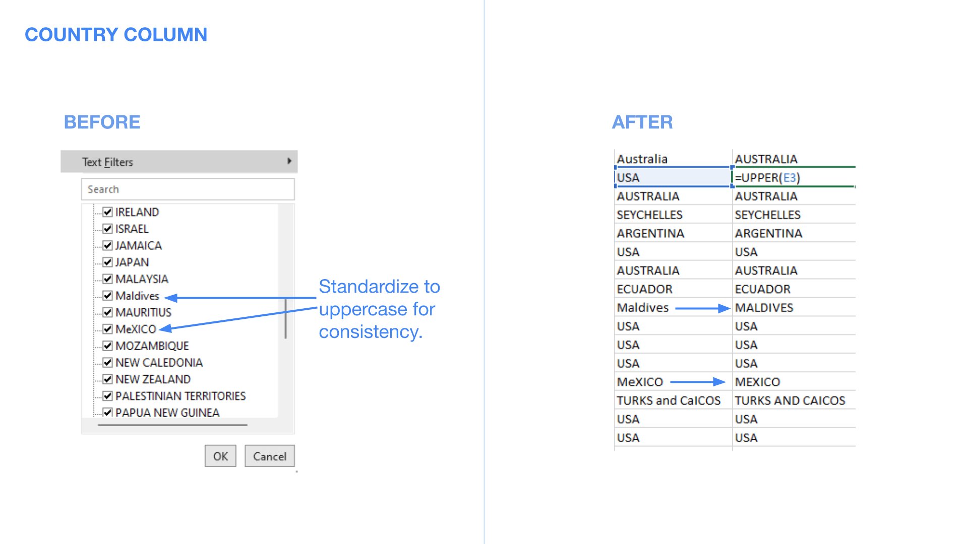
5. Standardizing Country Names
Countries were all over the place, spelling errors, random capitalization, you name it. I fixed that by converting everything to uppercase and correcting inconsistencies.
5. Standardizing Country Names
Countries were all over the place, spelling errors, random capitalization, you name it. I fixed that by converting everything to uppercase and correcting inconsistencies.
5. Standardizing Country Names
Countries were all over the place, spelling errors, random capitalization, you name it. I fixed that by converting everything to uppercase and correcting inconsistencies.
5. Standardizing Country Names
Countries were all over the place, spelling errors, random capitalization, you name it. I fixed that by converting everything to uppercase and correcting inconsistencies.
6. Cleaning the Activity Column
When people enter “Swimming, Swims, Swam,” they mean the same thing. I consolidated variations into standardized categories.
6. Cleaning the Activity Column
When people enter “Swimming, Swims, Swam,” they mean the same thing. I consolidated variations into standardized categories.
6. Cleaning the Activity Column
When people enter “Swimming, Swims, Swam,” they mean the same thing. I consolidated variations into standardized categories.
6. Cleaning the Activity Column
When people enter “Swimming, Swims, Swam,” they mean the same thing. I consolidated variations into standardized categories.

7. Fixing Victim Details
Created a “Victims” column to accurately reflect the number of individuals involved.
7. Fixing Victim Details
Created a “Victims” column to accurately reflect the number of individuals involved.
7. Fixing Victim Details
Created a “Victims” column to accurately reflect the number of individuals involved.
7. Fixing Victim Details
Created a “Victims” column to accurately reflect the number of individuals involved.

Replaced placeholders in the “Name” column with “Unknown” where necessary.
Replaced placeholders in the “Name” column with “Unknown” where necessary.
Replaced placeholders in the “Name” column with “Unknown” where necessary.
Replaced placeholders in the “Name” column with “Unknown” where necessary.

Standardized the “Sex” column.
Standardized the “Sex” column.
Standardized the “Sex” column.
Standardized the “Sex” column.

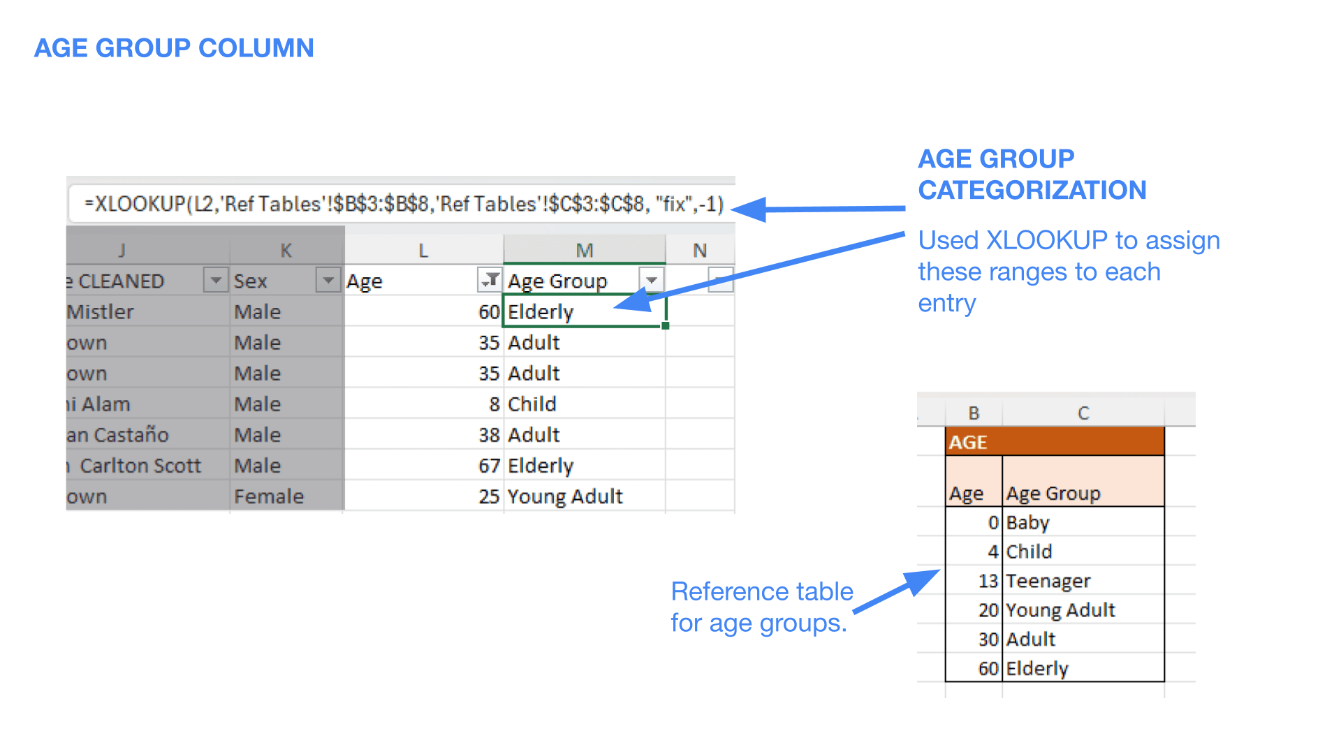
8. Age Group Categorization
Because analyzing raw ages is messy, I grouped them into categories:
8. Age Group Categorization
Because analyzing raw ages is messy, I grouped them into categories:
8. Age Group Categorization
Because analyzing raw ages is messy, I grouped them into categories:
8. Age Group Categorization
Because analyzing raw ages is messy, I grouped them into categories:
0-3: Baby
0-3: Baby
0-3: Baby
0-3: Baby
4-12: Child
4-12: Child
4-12: Child
4-12: Child
13-19: Teenager
13-19: Teenager
13-19: Teenager
13-19: Teenager
20-30: Young Adult
20-30: Young Adult
20-30: Young Adult
20-30: Young Adult
30-60: Adult
30-60: Adult
30-60: Adult
30-60: Adult
60+: Elderly
60+: Elderly
60+: Elderly
60+: Elderly
I then used XLOOKUP to assign each entry to the right category.
I then used XLOOKUP to assign each entry to the right category.
I then used XLOOKUP to assign each entry to the right category.
I then used XLOOKUP to assign each entry to the right category.
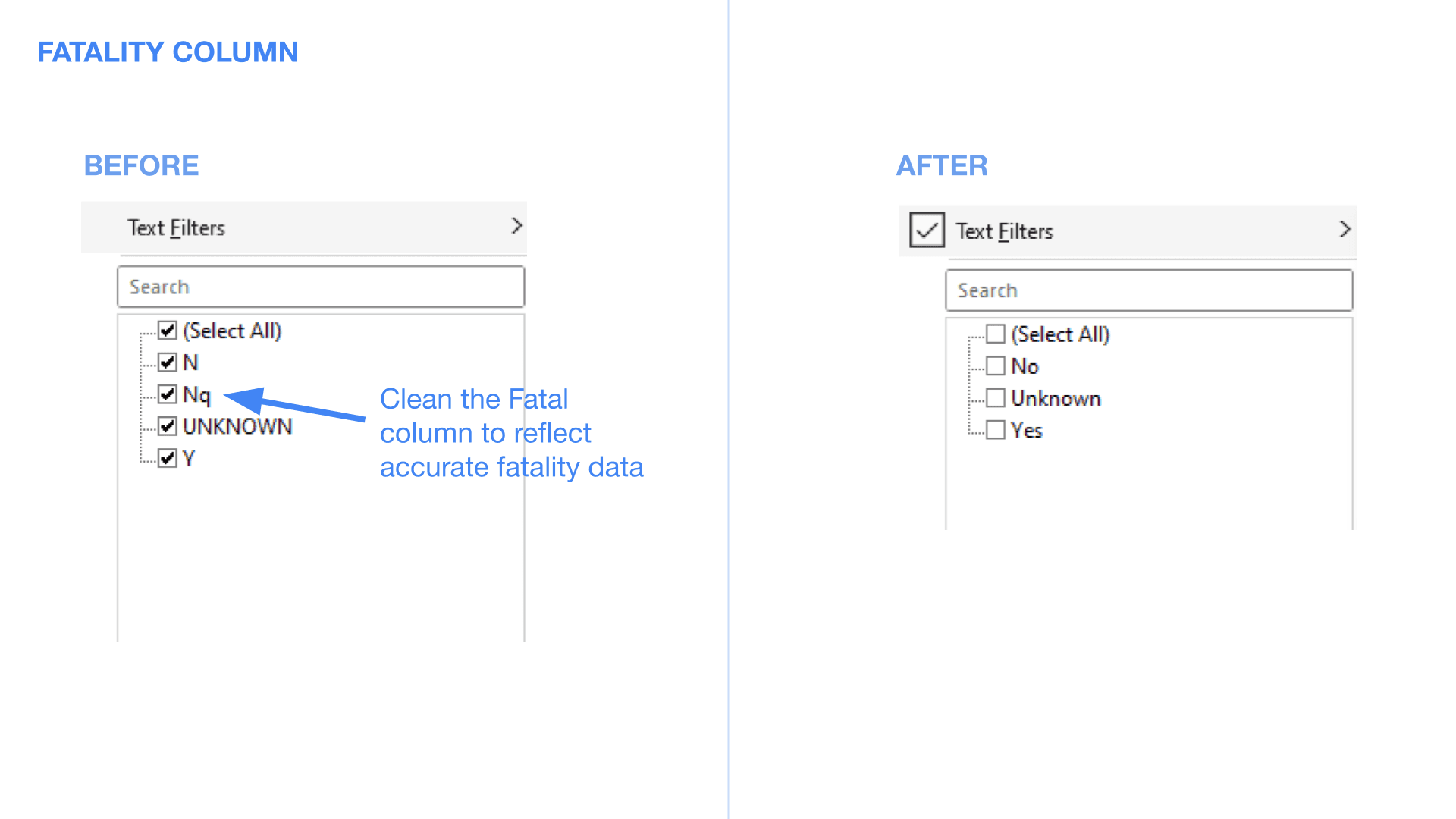
9. Cleaning Up Injury & Fatality Data
Consolidated “Injury” descriptions into broader categories (e.g., “Legs” instead of “Ankle, Thigh, Calf”).
9. Cleaning Up Injury & Fatality Data
Consolidated “Injury” descriptions into broader categories (e.g., “Legs” instead of “Ankle, Thigh, Calf”).
9. Cleaning Up Injury & Fatality Data
Consolidated “Injury” descriptions into broader categories (e.g., “Legs” instead of “Ankle, Thigh, Calf”).
9. Cleaning Up Injury & Fatality Data
Consolidated “Injury” descriptions into broader categories (e.g., “Legs” instead of “Ankle, Thigh, Calf”).

Standardized fatality data for clear yes/no insights.
Standardized fatality data for clear yes/no insights.
Standardized fatality data for clear yes/no insights.
Standardized fatality data for clear yes/no insights.
10. Organizing Time of Day
Grouped attacks into morning, afternoon, evening, and night for better trend analysis.
10. Organizing Time of Day
Grouped attacks into morning, afternoon, evening, and night for better trend analysis.
10. Organizing Time of Day
Grouped attacks into morning, afternoon, evening, and night for better trend analysis.
10. Organizing Time of Day
Grouped attacks into morning, afternoon, evening, and night for better trend analysis.

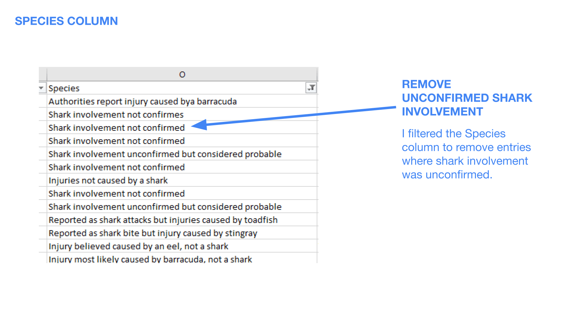
11. Shark Species Standardization
Removed unconfirmed shark involvement cases.
11. Shark Species Standardization
Removed unconfirmed shark involvement cases.
11. Shark Species Standardization
Removed unconfirmed shark involvement cases.
11. Shark Species Standardization
Removed unconfirmed shark involvement cases.
Cleaned up species naming conventions and categorized unknown sharks as Unidentified.
Cleaned up species naming conventions and categorized unknown sharks as Unidentified.
Cleaned up species naming conventions and categorized unknown sharks as Unidentified.
Cleaned up species naming conventions and categorized unknown sharks as Unidentified.

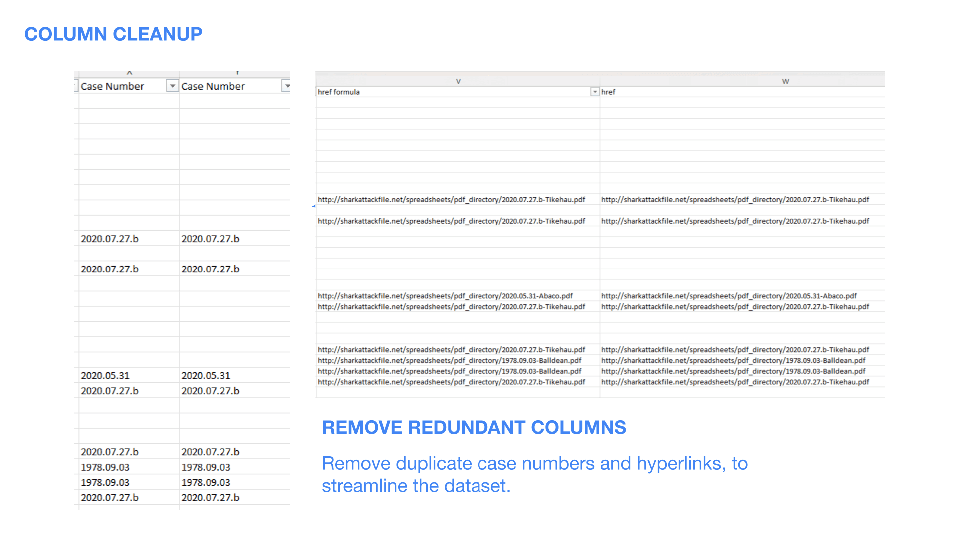
12. Streamlining Columns
Got rid of redundant data; duplicate case numbers, hyperlinks, and unnecessary columns because clutter is the enemy of good analysis.
12. Streamlining Columns
Got rid of redundant data; duplicate case numbers, hyperlinks, and unnecessary columns because clutter is the enemy of good analysis.
12. Streamlining Columns
Got rid of redundant data; duplicate case numbers, hyperlinks, and unnecessary columns because clutter is the enemy of good analysis.
12. Streamlining Columns
Got rid of redundant data; duplicate case numbers, hyperlinks, and unnecessary columns because clutter is the enemy of good analysis.
Data Analysis: The Good Stuff
Data Analysis: The Good Stuff
Data Analysis: The Good Stuff
Data Analysis: The Good Stuff
With clean data in hand, I built a dashboard to uncover key insights:
With clean data in hand, I built a dashboard to uncover key insights:
With clean data in hand, I built a dashboard to uncover key insights:
With clean data in hand, I built a dashboard to uncover key insights:
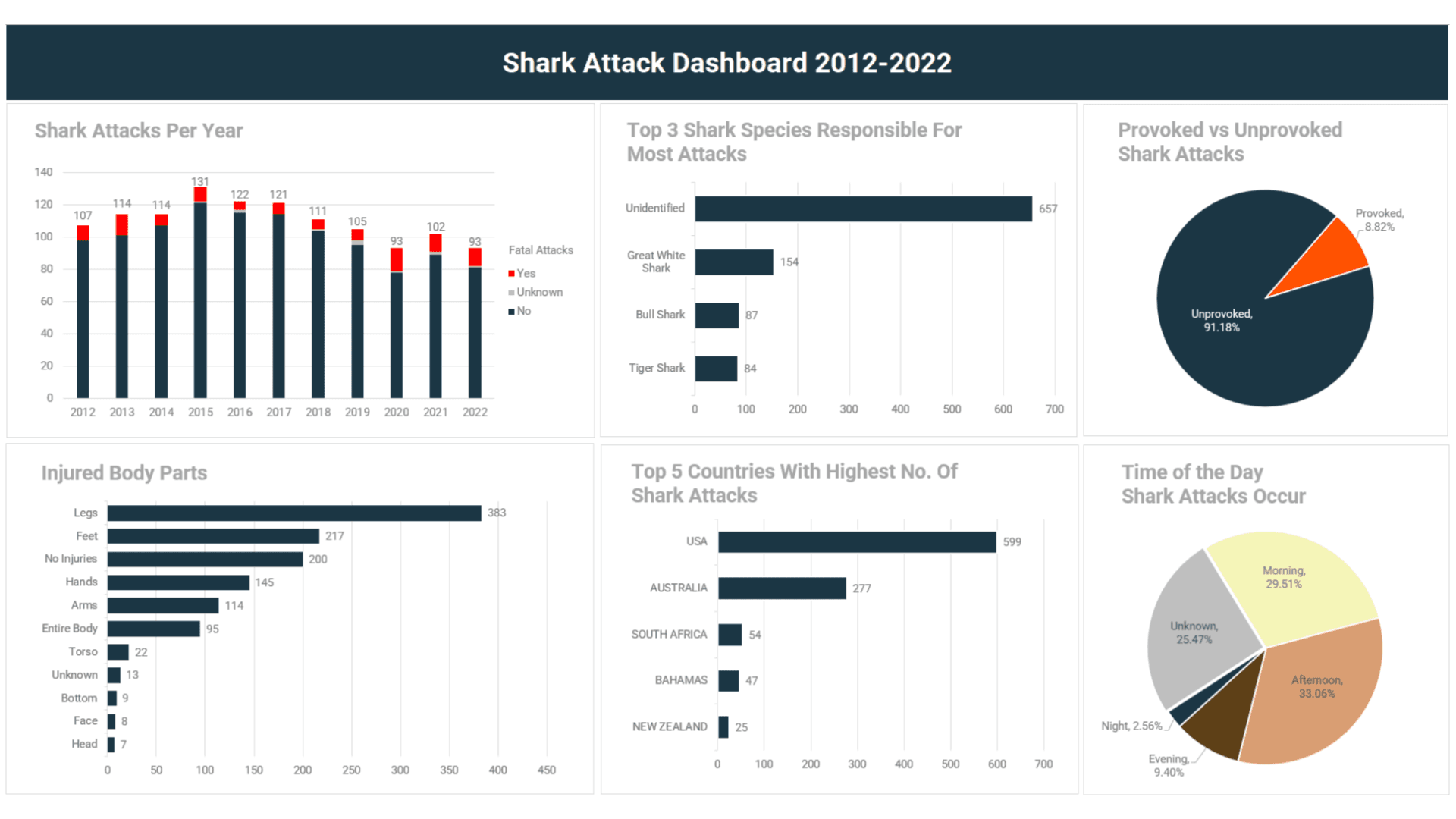
1. Shark Attacks Per Year
Majority of shark attacks? Non-fatal.
1. Shark Attacks Per Year
Majority of shark attacks? Non-fatal.
1. Shark Attacks Per Year
Majority of shark attacks? Non-fatal.
1. Shark Attacks Per Year
Majority of shark attacks? Non-fatal.

2. Top Shark Species Responsible for Attacks
White sharks, Bull sharks, and Tiger sharks are the usual suspects, big and aggressive.
2. Top Shark Species Responsible for Attacks
White sharks, Bull sharks, and Tiger sharks are the usual suspects, big and aggressive.
2. Top Shark Species Responsible for Attacks
White sharks, Bull sharks, and Tiger sharks are the usual suspects, big and aggressive.
2. Top Shark Species Responsible for Attacks
White sharks, Bull sharks, and Tiger sharks are the usual suspects, big and aggressive.

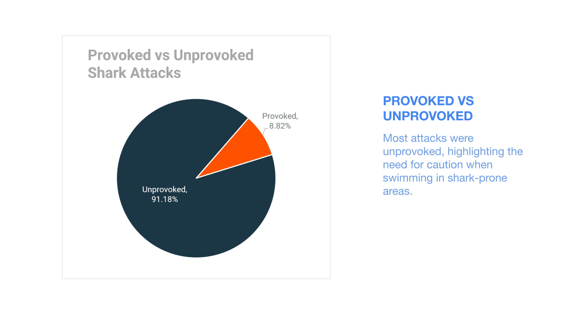
3. Provoked vs. Unprovoked Incidents
Most attacks are unprovoked, meaning people aren’t out there messing with sharks, they just happen to be in the wrong place at the wrong time.
3. Provoked vs. Unprovoked Incidents
Most attacks are unprovoked, meaning people aren’t out there messing with sharks, they just happen to be in the wrong place at the wrong time.
3. Provoked vs. Unprovoked Incidents
Most attacks are unprovoked, meaning people aren’t out there messing with sharks, they just happen to be in the wrong place at the wrong time.
3. Provoked vs. Unprovoked Incidents
Most attacks are unprovoked, meaning people aren’t out there messing with sharks, they just happen to be in the wrong place at the wrong time.
4. Injury Trends
Legs are the most commonly injured body parts, probably because they move the most in the water, making them prime targets.
4. Injury Trends
Legs are the most commonly injured body parts, probably because they move the most in the water, making them prime targets.
4. Injury Trends
Legs are the most commonly injured body parts, probably because they move the most in the water, making them prime targets.
4. Injury Trends
Legs are the most commonly injured body parts, probably because they move the most in the water, making them prime targets.

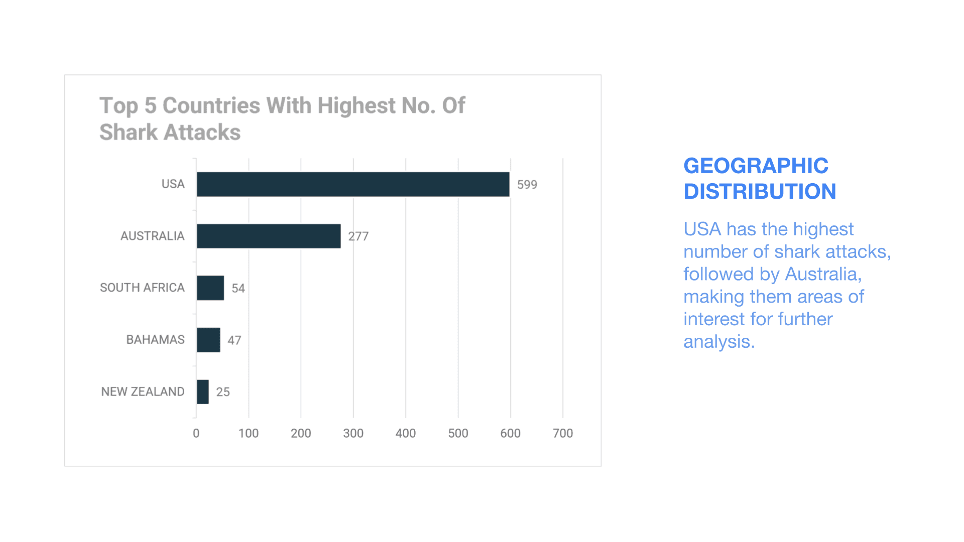
5. Geographic Distribution
The USA and Australia have the highest number of shark attacks, making them key areas for further study.
5. Geographic Distribution
The USA and Australia have the highest number of shark attacks, making them key areas for further study.
5. Geographic Distribution
The USA and Australia have the highest number of shark attacks, making them key areas for further study.
5. Geographic Distribution
The USA and Australia have the highest number of shark attacks, making them key areas for further study.
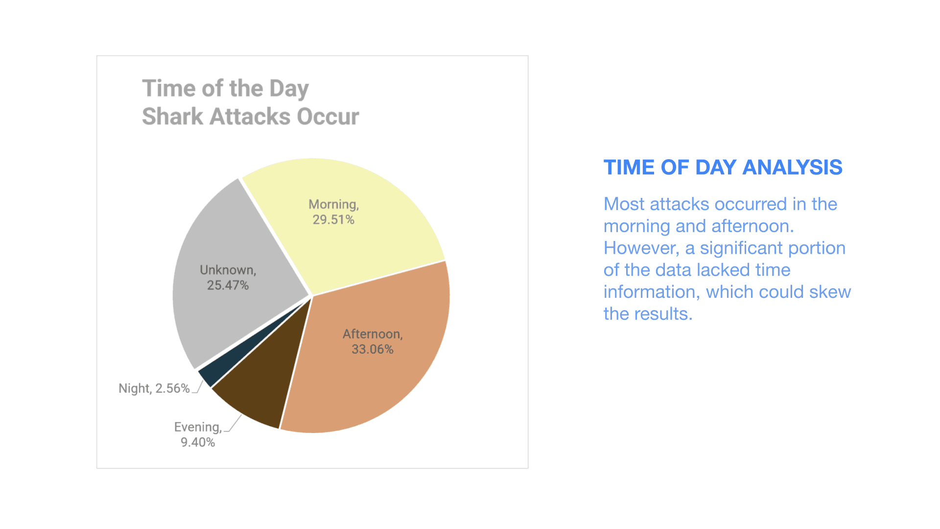
6. Time of Day Trends
Most attacks happen in the morning and afternoon, though a lack of time data in many cases means we need more info to confirm strong patterns.
6. Time of Day Trends
Most attacks happen in the morning and afternoon, though a lack of time data in many cases means we need more info to confirm strong patterns.
6. Time of Day Trends
Most attacks happen in the morning and afternoon, though a lack of time data in many cases means we need more info to confirm strong patterns.
6. Time of Day Trends
Most attacks happen in the morning and afternoon, though a lack of time data in many cases means we need more info to confirm strong patterns.
Final Thoughts
This project was all about turning messy data into real insights. Once cleaned, the dataset gave us a clear picture of global shark attack trends. Key takeaways? Most shark attacks are non-fatal and unprovoked, the USA and Australia are hotspots, and White, Bull, and Tiger sharks are the ones to watch out for.
Data cleaning may not be the flashiest part of analytics, but trust me it’s the secret sauce that makes everything work.
Data cleaning may not be the flashiest part of analytics, but trust me it’s the secret sauce that makes everything work.
Data cleaning may not be the flashiest part of analytics, but trust me it’s the secret sauce that makes everything work.
Data cleaning may not be the flashiest part of analytics, but trust me it’s the secret sauce that makes everything work.
Need help cleaning and analyzing your data? Let's chat!
GET IN TOUCH
Need help cleaning and analyzing your data? Let's chat!
GET IN TOUCH
Need help cleaning and analyzing your data? Let's chat!
GET IN TOUCH
Need help cleaning and analyzing your data? Let's chat!
GET IN TOUCH

